Dingo petfood
Friendly and Playful Style
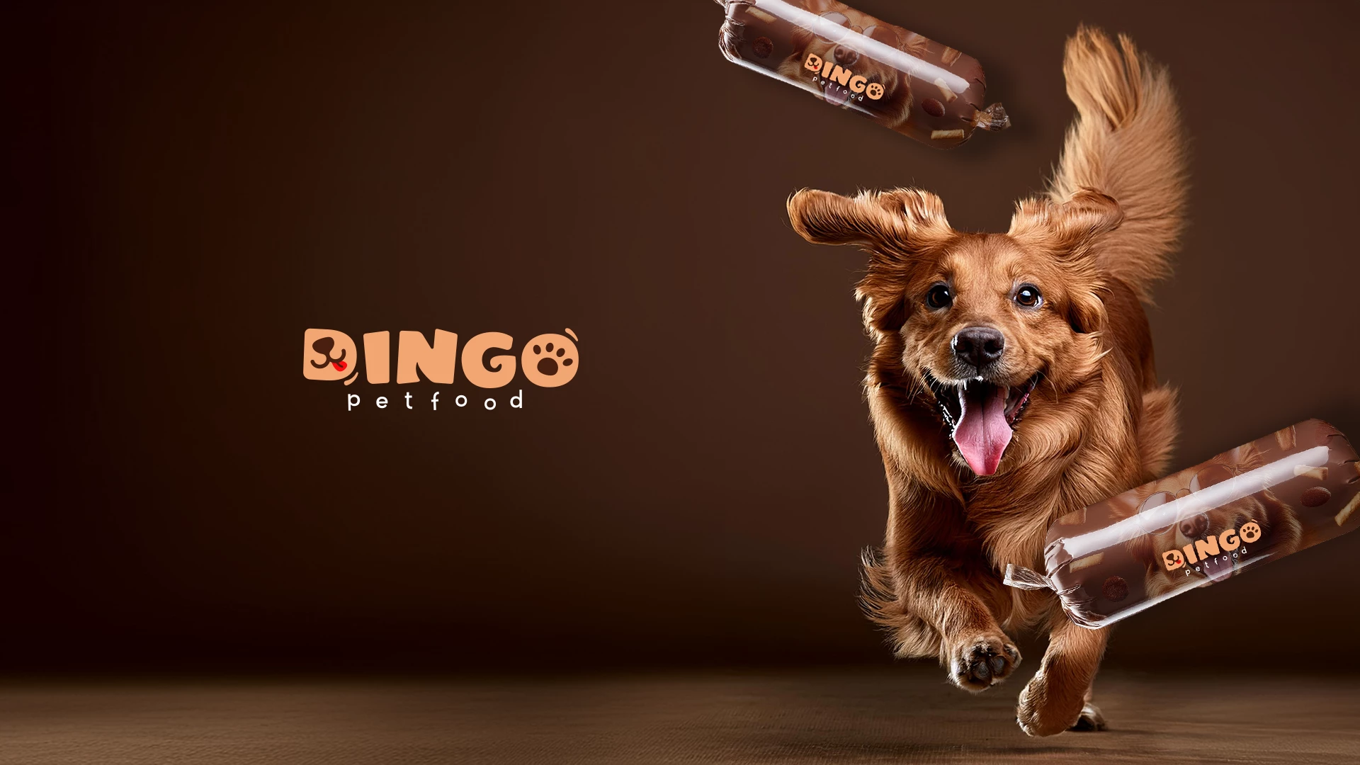
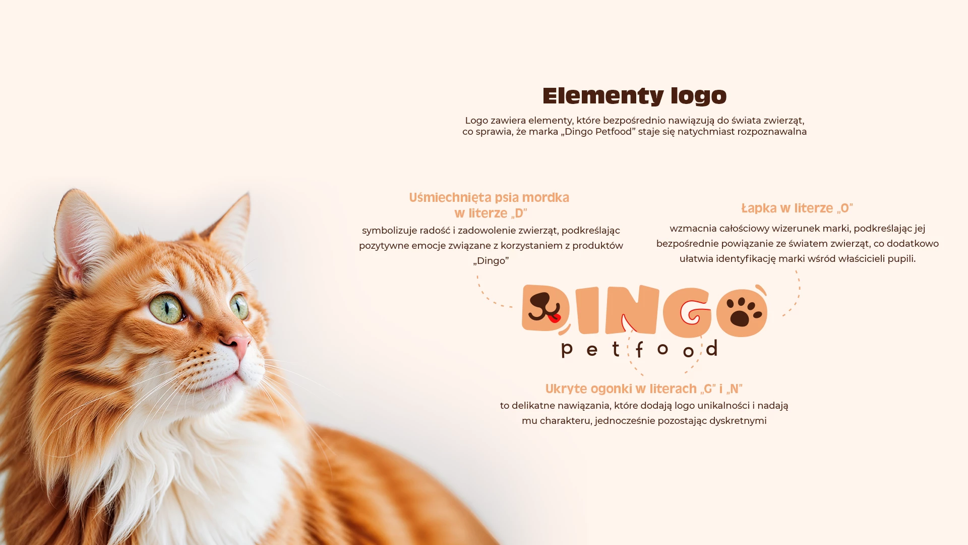
Pet owners often treat their animals as family members—or even as their own children. That’s why the logo was designed in a friendly, playful style that reflects this deep emotional bond.
Soft, rounded letterforms and warm colors such as browns and oranges help create a brand image that conveys care, affection, and a commitment to the health and happiness of pets.
The Letter “D” as a Brand Identifier
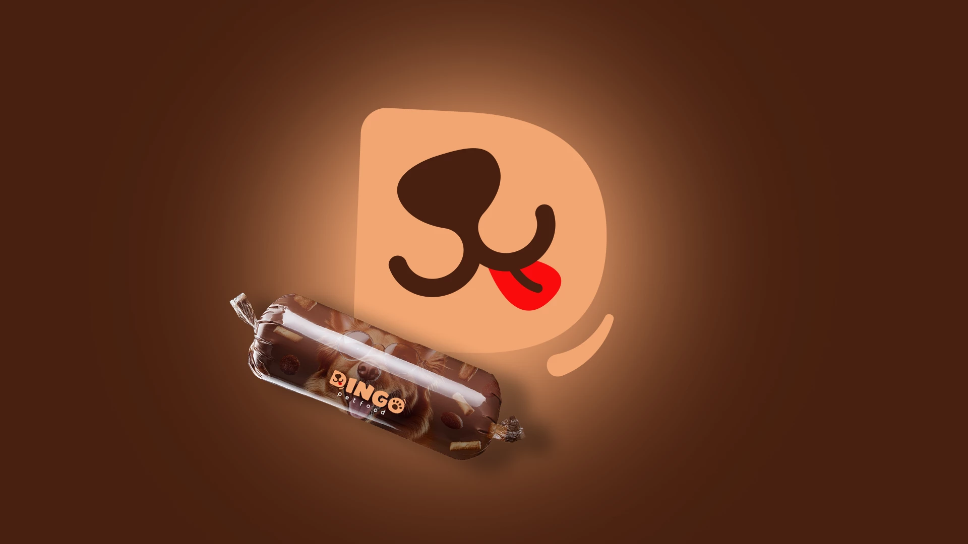
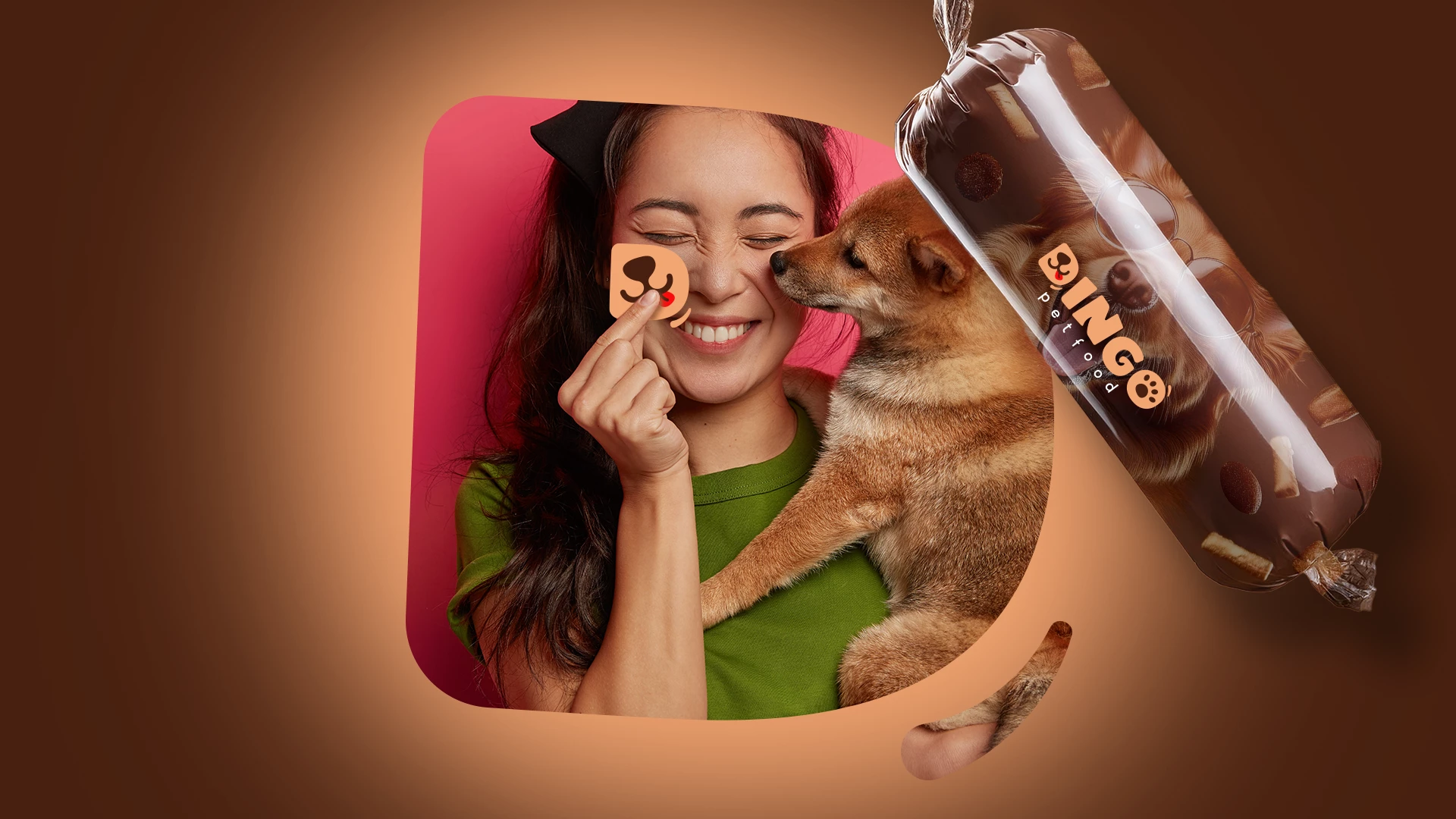
The letter “D” featuring a smiling dog face with a sticking-out tongue can serve as a standalone brand mark. This playful and memorable symbol allows Dingo Petfood to be easily recognized across promotional materials, packaging, and marketing communication.
Name as Logo
In line with the brand strategy, the “Dingo” logo was designed so that the brand name itself functions as the logo. This approach ensures the mark is both distinctive and simple, enhancing memorability and brand recognition.
Logo Versatility
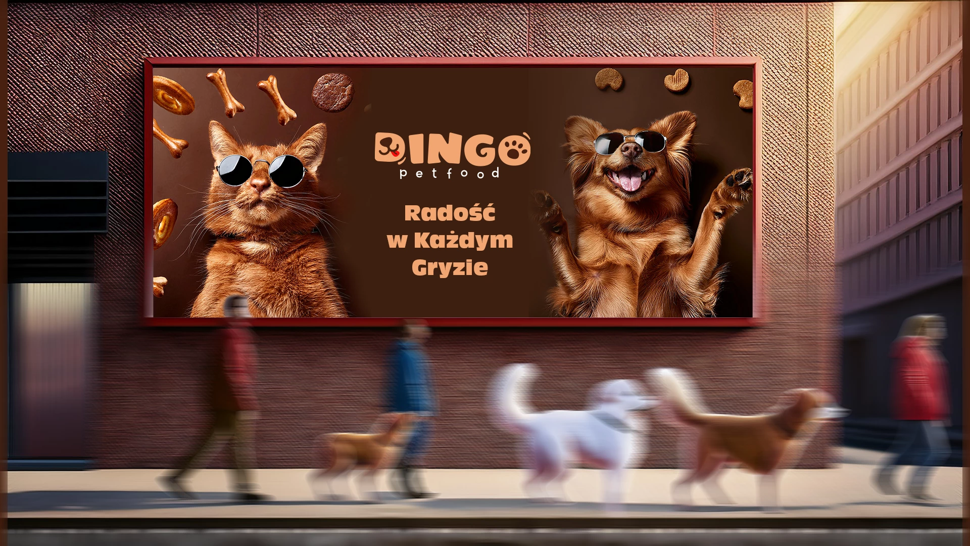
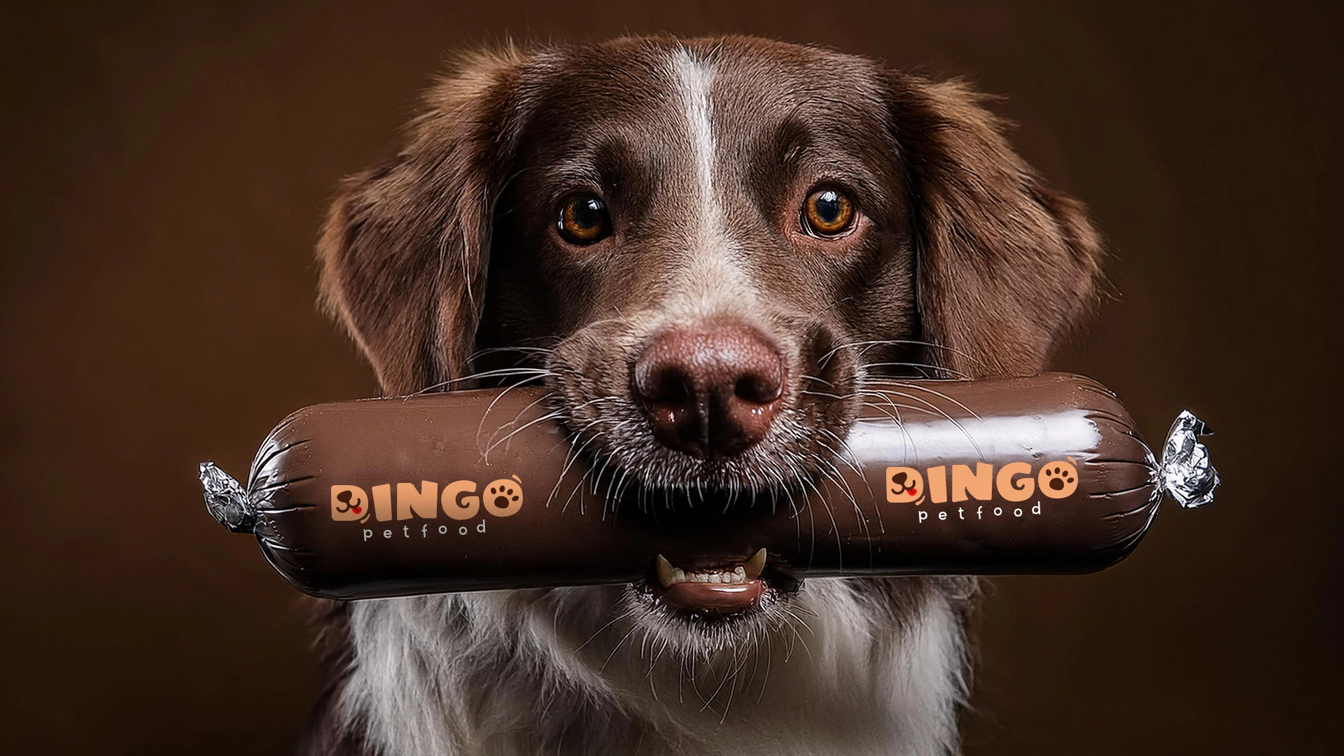
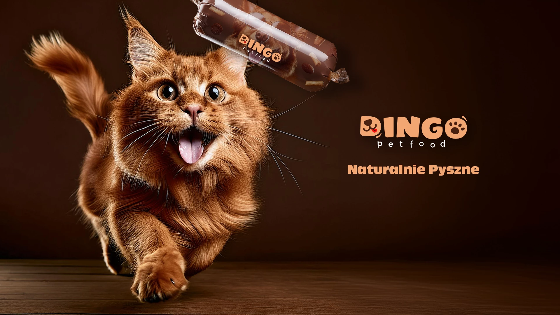
The logo is designed to be versatile and easily adaptable across various media—from packaging and promotional materials to the website.
Its clean and legible form ensures it looks great at any size and on different backgrounds, which is essential for building a strong and consistent brand presence.
