OLCHOWSKA
OLCHOWSKA – logo design.
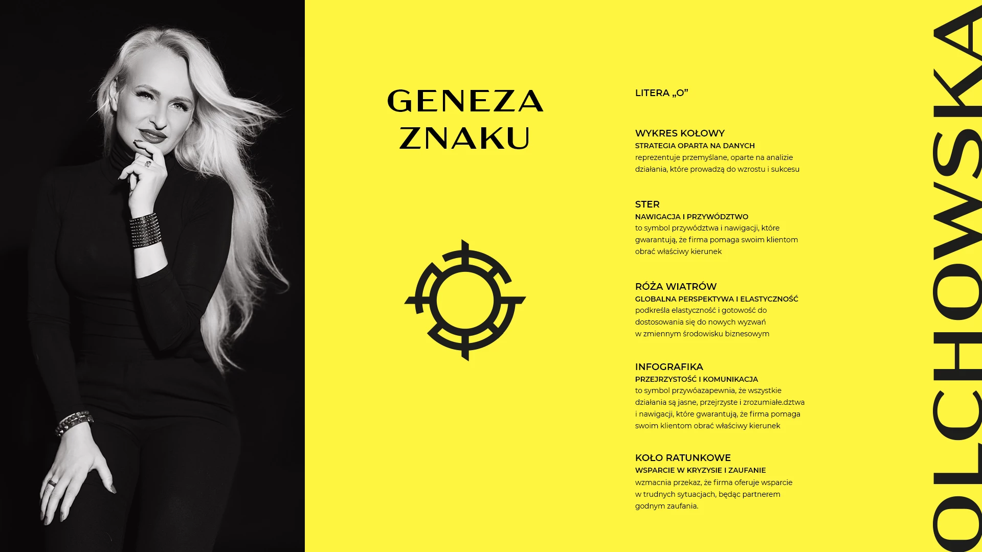
Logo proposal is a harmonious blend of modern design and symbolism that reflects the core values of the Olchowska brand.
The logo subtly communicates innovation, a strategic mindset, and the support provided to clients.
A pie chart symbolizes analysis and measurable results, highlighting the strategic nature of the consulting services.
The helm represents leadership and navigation—the company guides clients toward success, offering confidence and stability in difficult decisions.
The compass rose signifies a global perspective and flexibility, enabling the firm to operate effectively in a dynamic business environment.
The infographic element conveys clarity and efficiency—the company presents complex solutions in a clear, understandable way.
A lifebuoy underscores the company’s role as a reliable support system during crises, providing solutions that ensure security and operational confidence.
The composition is complemented by a yellow color, symbolizing energy, innovation, and helping the brand stand out in a competitive landscape.
Additionally, the typeface used in the logo is bold and modern, giving the brand a professional appearance while maintaining a subtly feminine quality.
A delicate, fashion-inspired typographic accent adds elegance, emphasizing the individuality and style of the personal brand.
The logo serves as a modern visual representation of the company’s values, combining aesthetics with a message of result-driven business support.

