PRESSON
PRESSON
Naming
The name PRESSON was created to reflect the brand’s core attributes: strength, durability, and uninterrupted performance.
“Press” refers to pressure and force, highlighting the robust and high-performance nature of the technical hoses.
“On” conveys continuity and reliability, reinforcing the idea of consistent operation and dependable quality.
Together, Presson stands for power under pressure and unwavering functionality.
Logo Concept
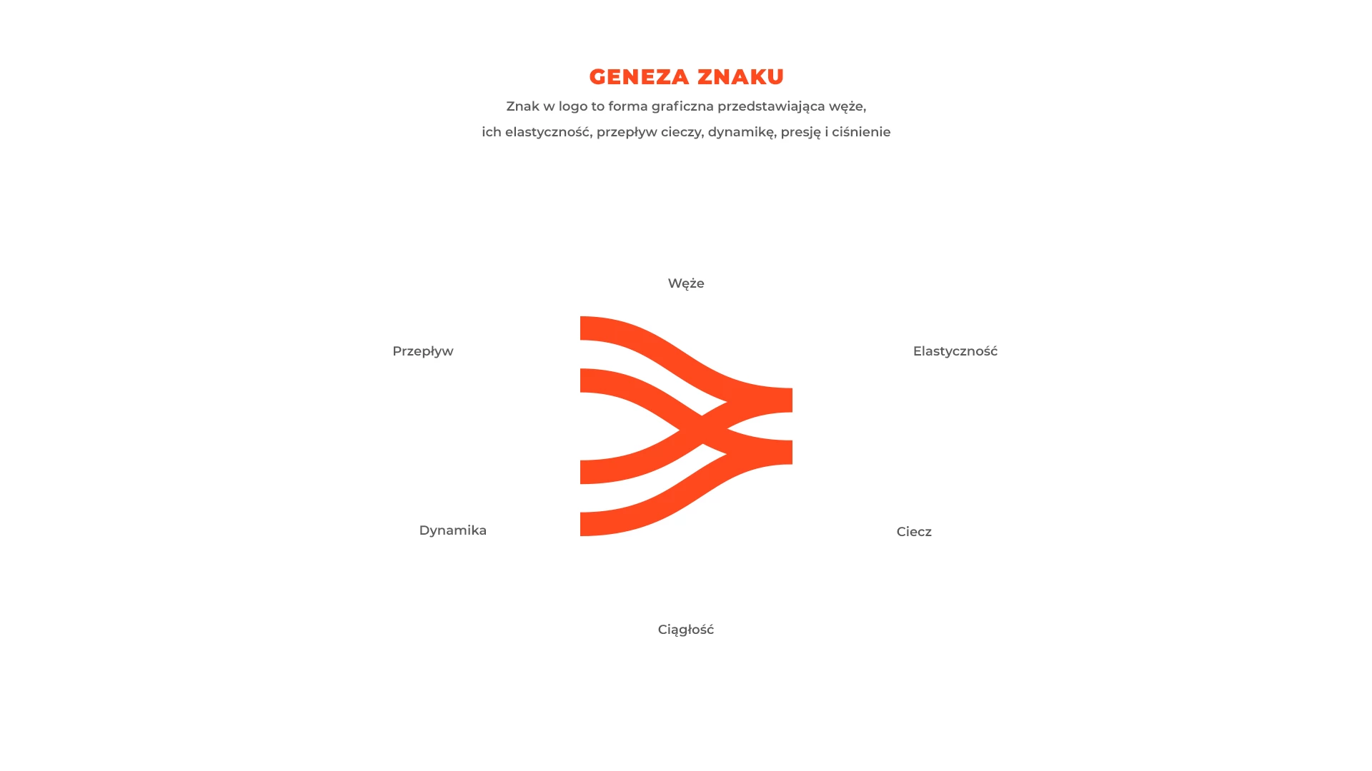
The logo symbol visually represents hoses in motion—capturing their flexibility, flow, dynamic pressure, and resilience.
It is a stylized interpretation of fluid motion through durable, high-pressure systems.
Key visual themes and keywords:
Hoses
Flow
Flexibility
Fluid
Continuity
Pressure
The identity is designed to convey industrial strength with modern precision, supporting the brand’s promise of dependable, high-quality solutions.
