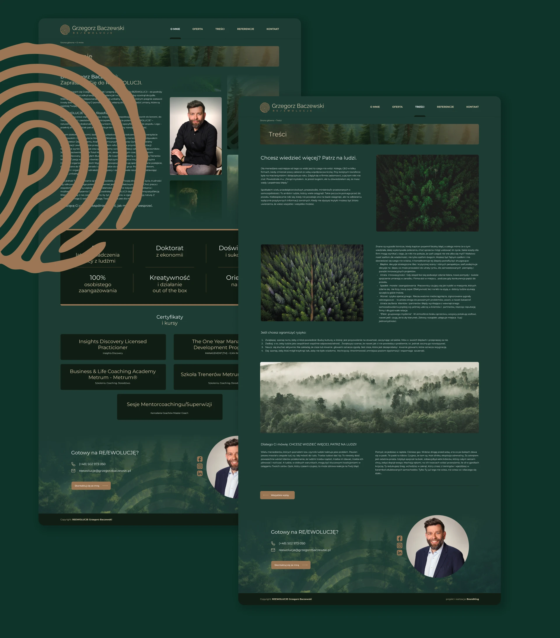
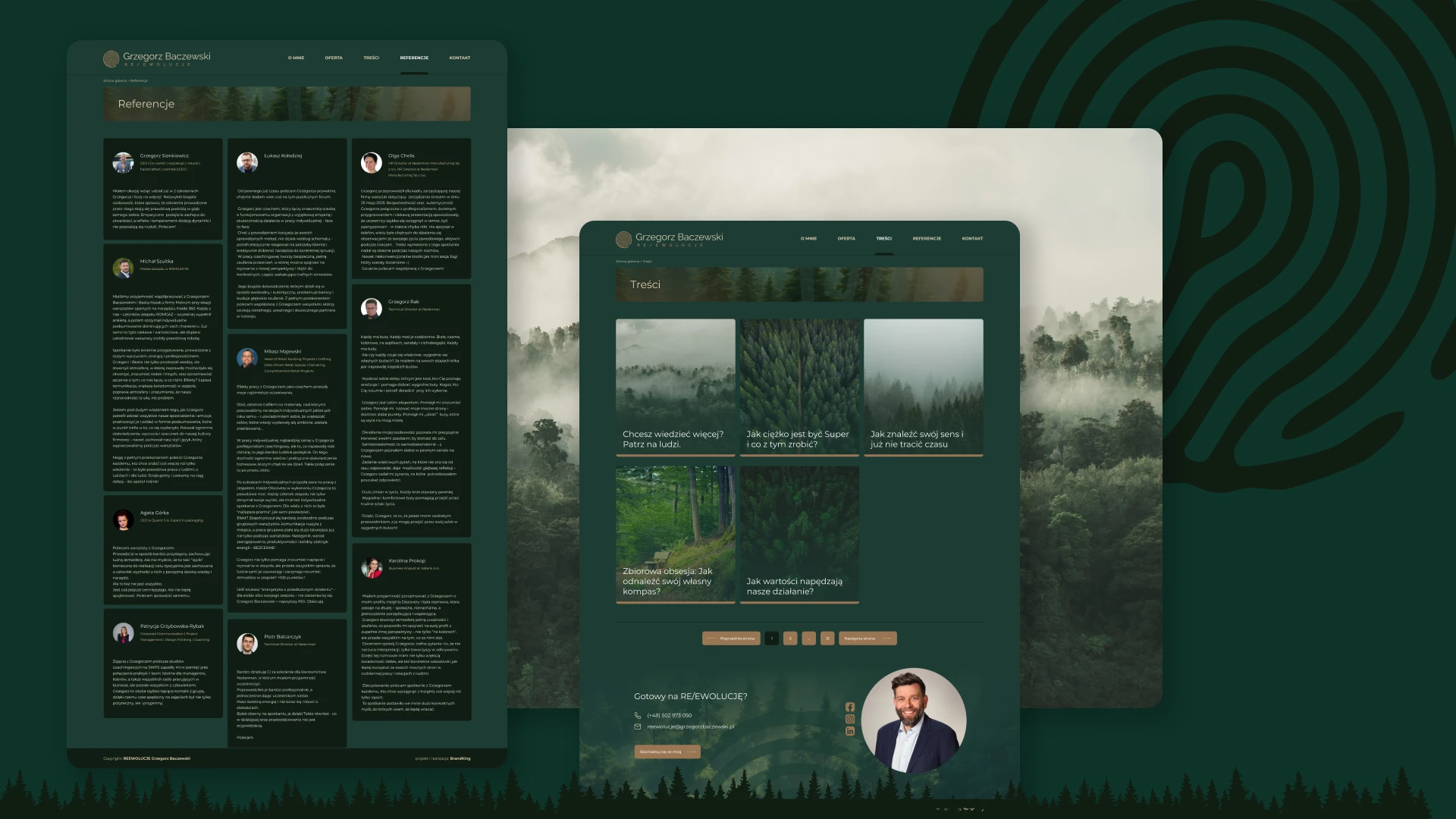
reewolucje
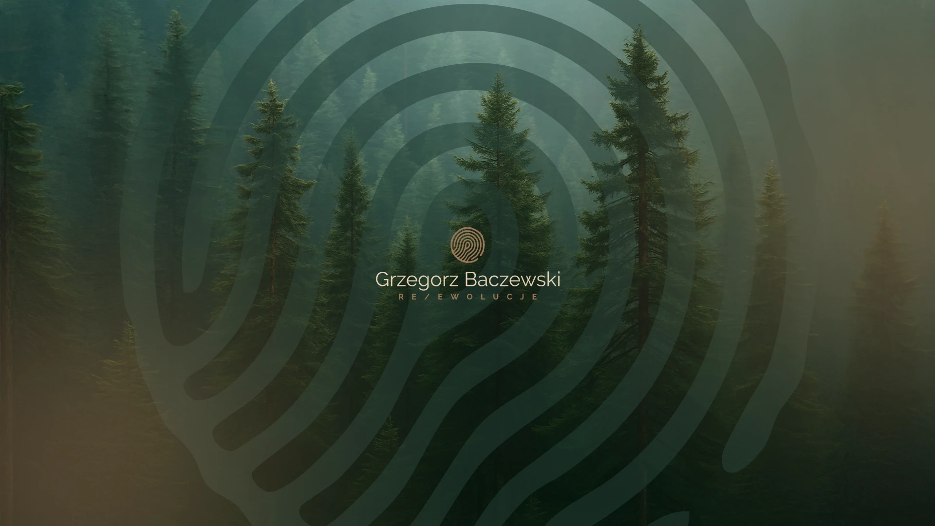
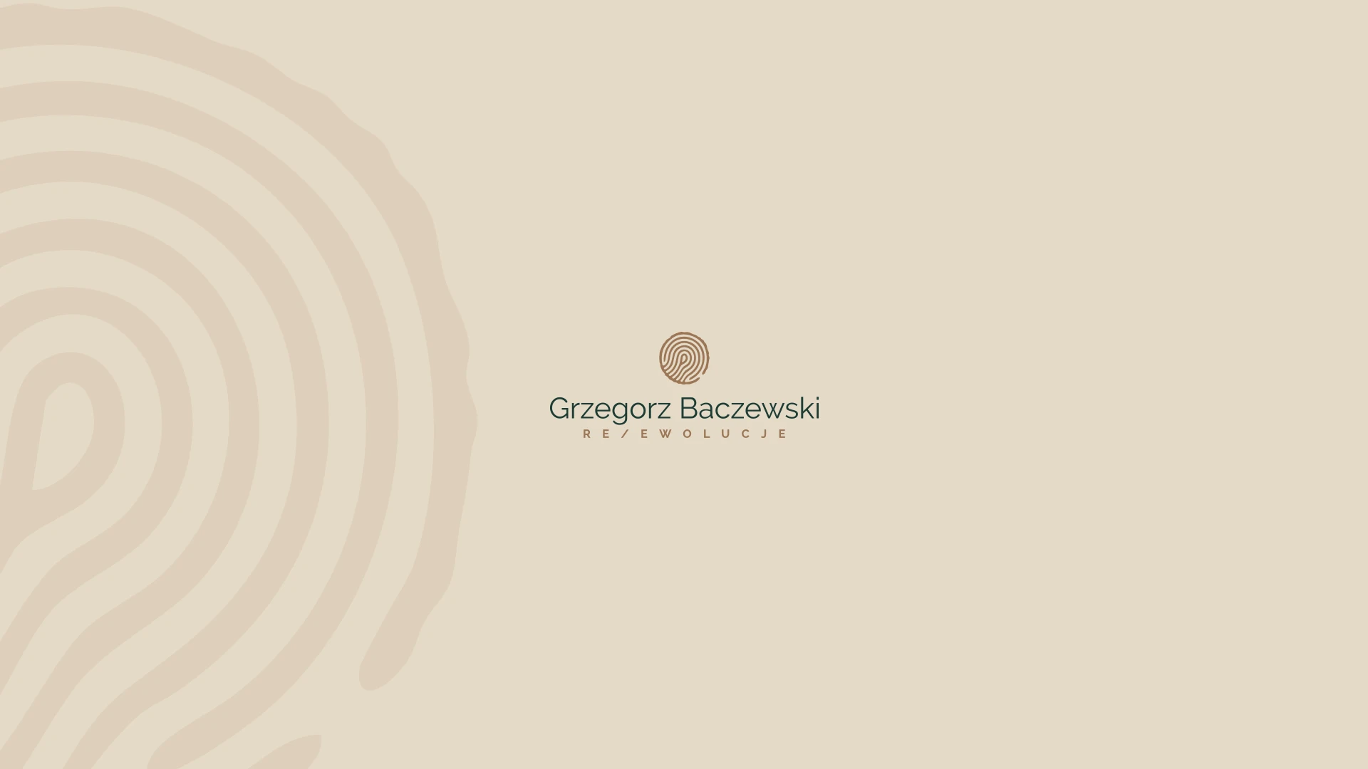
REEWOLUCJE Logo
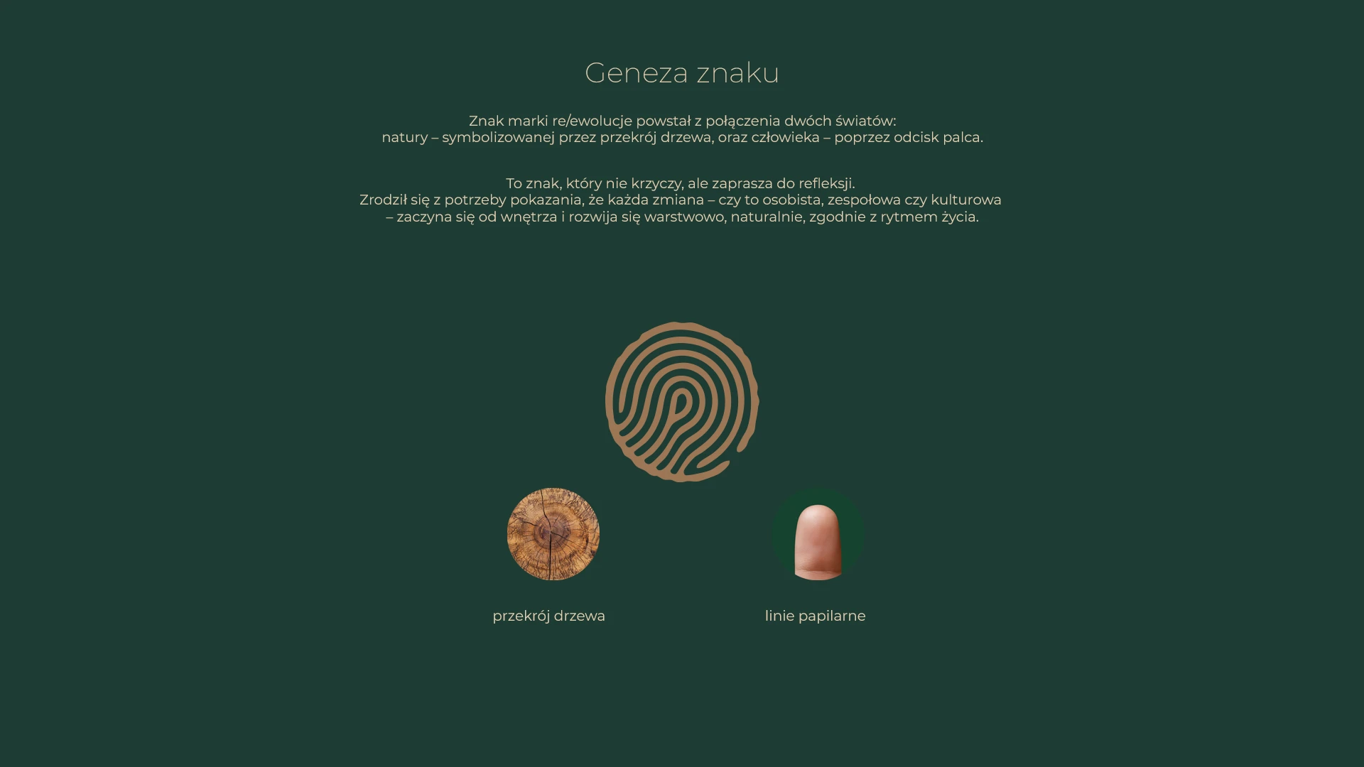
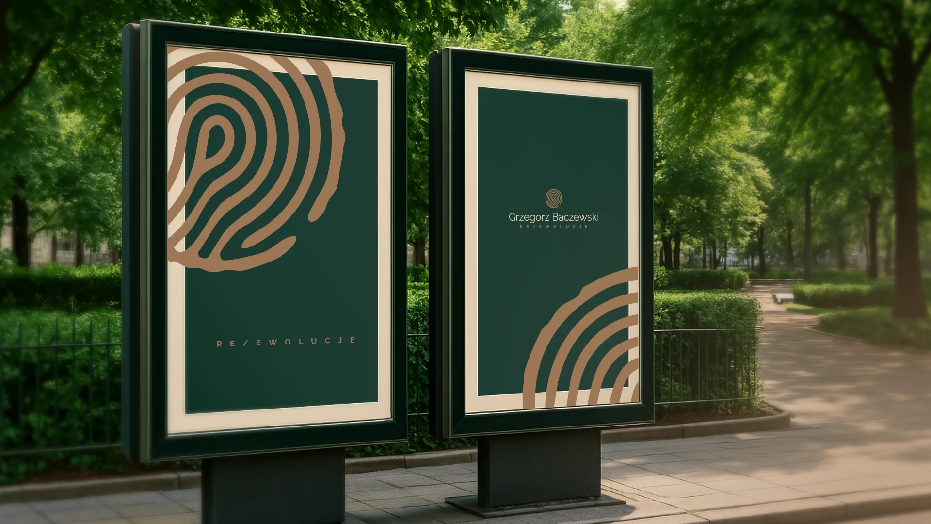
At the heart of the design is the symbol—a fusion of two key elements: a tree cross-section and fingerprint lines.
These motifs are combined within an irregular circular shape reminiscent of tree bark, emphasizing organic form, authenticity, and uniqueness.
Color Palette
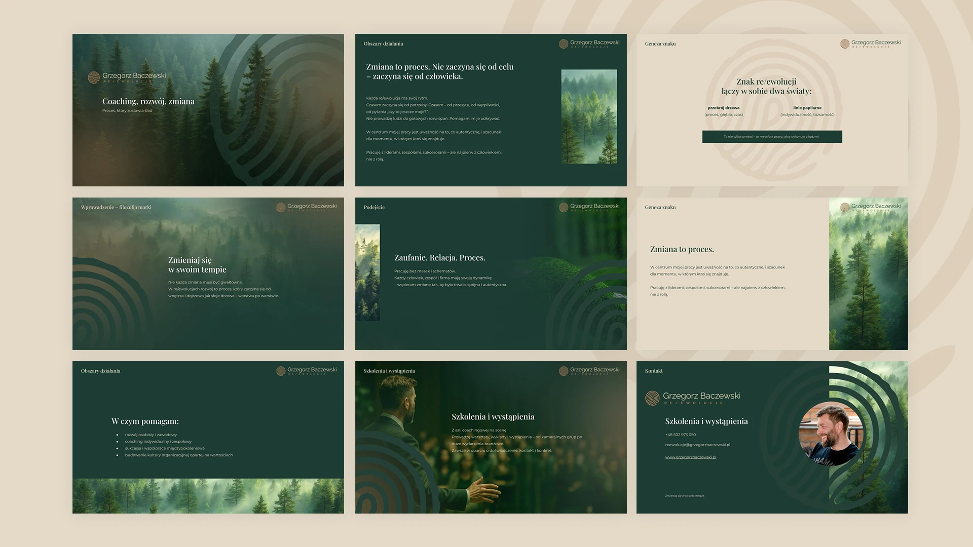
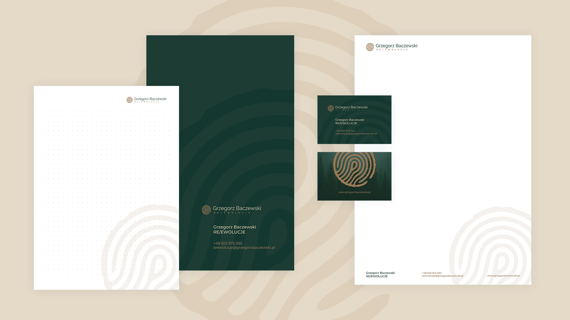
The visual identity is built around deep forest green and warm beige—a natural combination evoking groundedness, authentic process, and a connection to nature, all of which reflect the brand’s core essence.
Naming Form: re/ewolucje
I proposed a revised way of writing the name as re/ewolucje.
The slash not only gives the word a clearer graphic structure, but also symbolizes the dual path of transformation—revolutionary and evolutionary—which blend and complement each other in your work.
The typography remains neutral and elegant, ensuring the logo remains visually consistent across various formats and contexts.

webdesign

