Angelina Beauty Studio
Redesign logo Angelina - studio urody
Redesign of the “Angelina – Beauty Studio” Logo
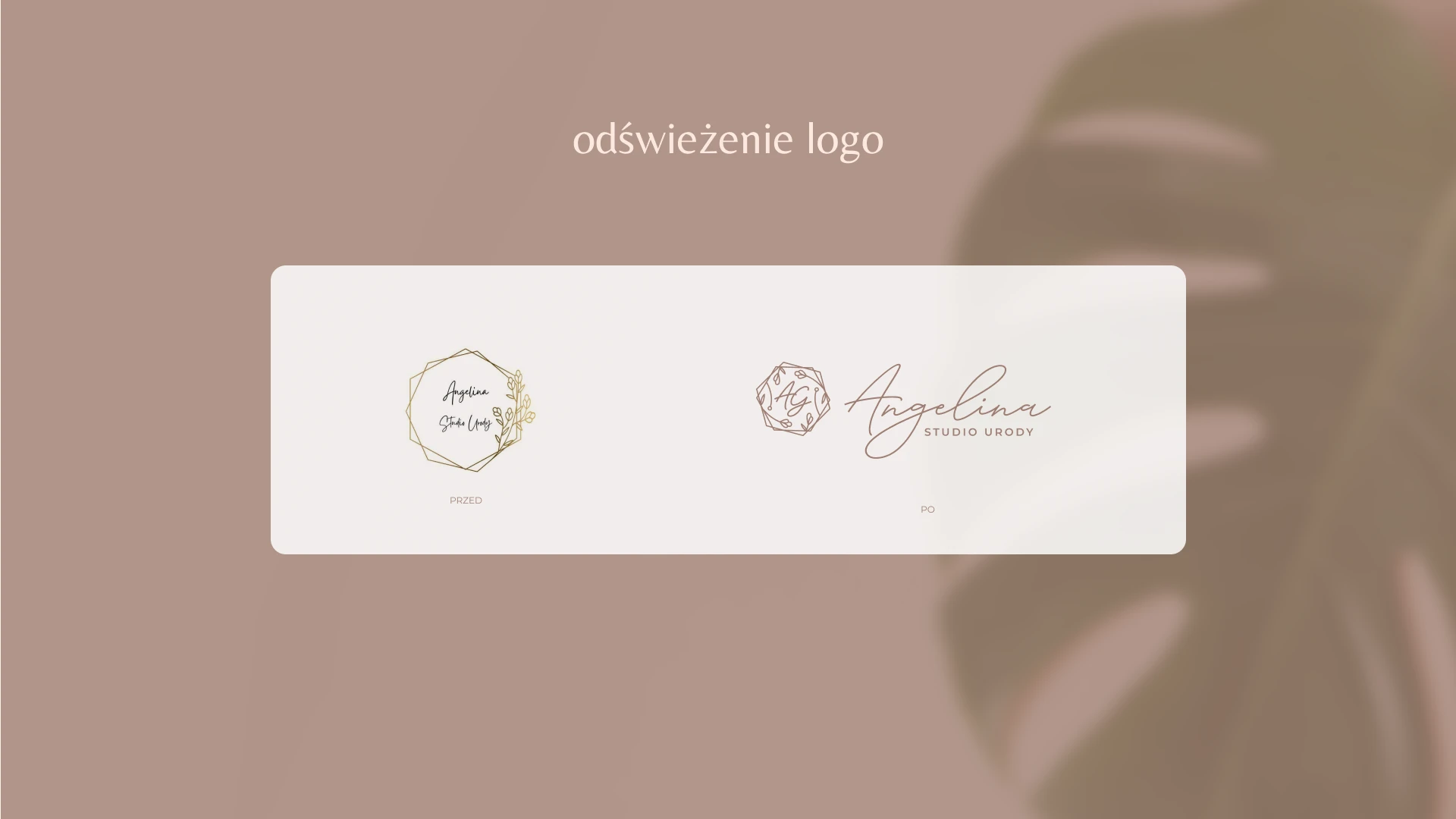
When refreshing the logo, I kept its original form and meaning — the distinctive geometric shape and botanical motifs still form its foundation. However, I refined them with a more modern, elegant line, giving the entire composition a fresh and contemporary look.
I added the initials AG, which can also be used separately as a monogram. This makes the logo more versatile — it works perfectly for example on social media, branded merchandise, or smaller promotional materials.
I also suggest changing the color palette. Instead of gold, which has become somewhat passé, I introduced modern powdery beige tones. These shades create a sense of lightness, freshness, and elegance — perfectly fitting the beauty industry’s aesthetic.
The main typeface remains handwritten to emphasize the brand’s personal character, while the phrase “Beauty Studio” is written in a simpler, more legible font. This helps create a clearer visual hierarchy and improved readability.
Thanks to these changes, the logo gains a modern character while remaining consistent with the brand’s existing identity.
