carbontear
carbontear – Visual Identity Design
A brand of trailers born from a passion for travel, freedom, and well-crafted functionality. I created a visual identity and symbol that combine the spirit of adventure with precision craftsmanship—capturing the brand’s essence in a way that is authentic, simple, and meaningful.
A Shared Passion for Movement, Silence, and Design
What connects me to carbontear is not only a shared aesthetic and functional mindset, but above all—a shared view of the world.
A desire to be on the move. To seek places where we can slow down and breathe deeply.
This project is the result of a common language of emotion and craftsmanship.
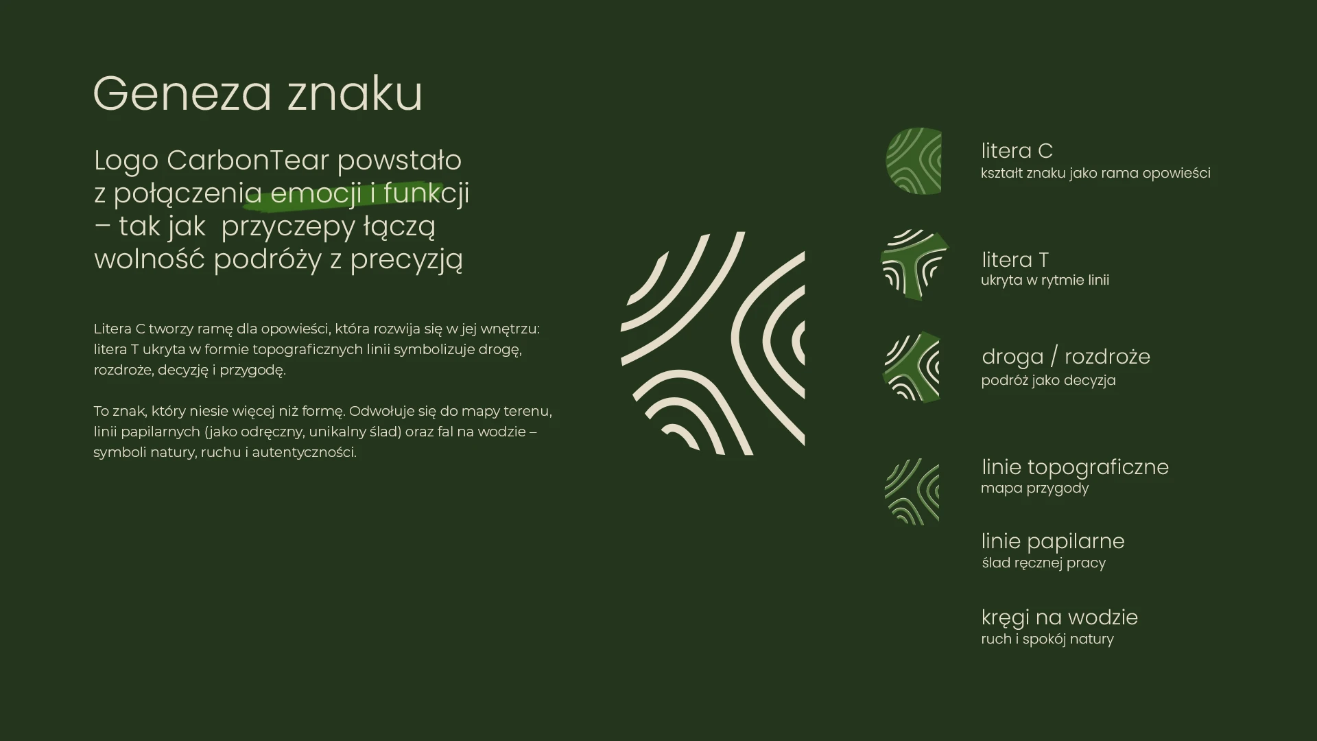
Logo Origin (This part’s especially fun!)
The mark is rich in layered symbolism:
Letter C – the shape as a frame for storytelling
Letter T – hidden within the rhythm of the lines
Road / Crossroads – the journey as a conscious choice
Topographic lines – the map of adventure
Fingerprint lines – the trace of handcrafted work
Ripples on water – movement and the calm of nature
Color, Form, and Style
The logo is built on a high-contrast combination of deep natural green and warm beige—colors that evoke peace, balance, and the outdoors.
This is complemented by an elegant, modern typeface that communicates the quality and attention to detail of the product.
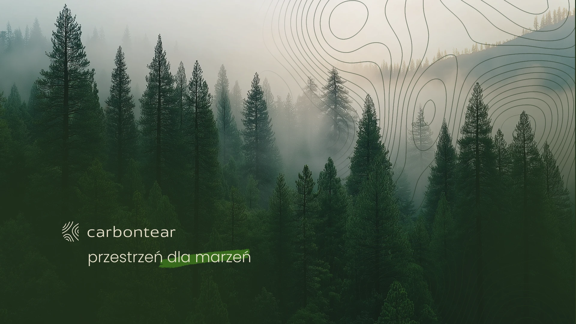
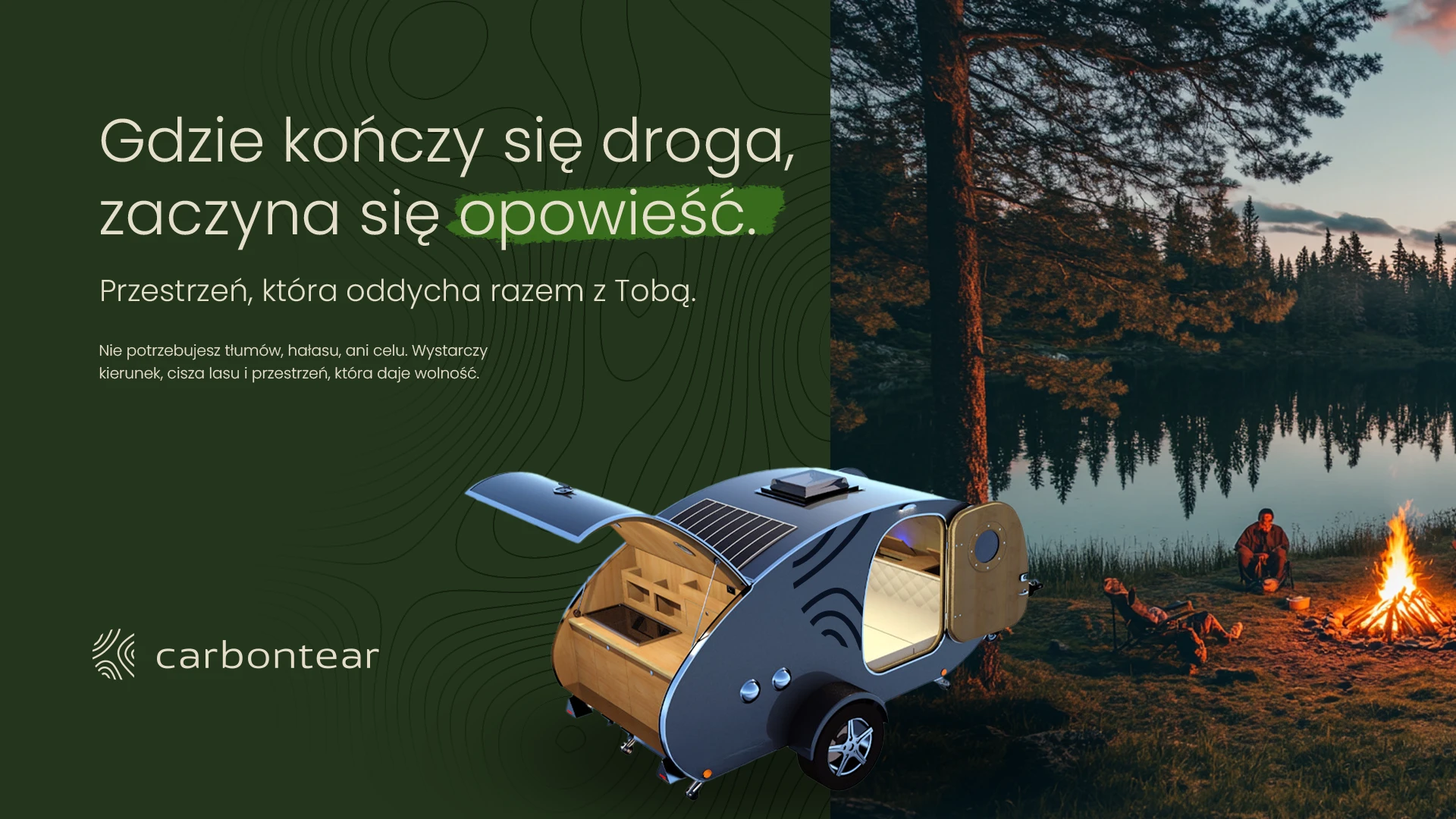
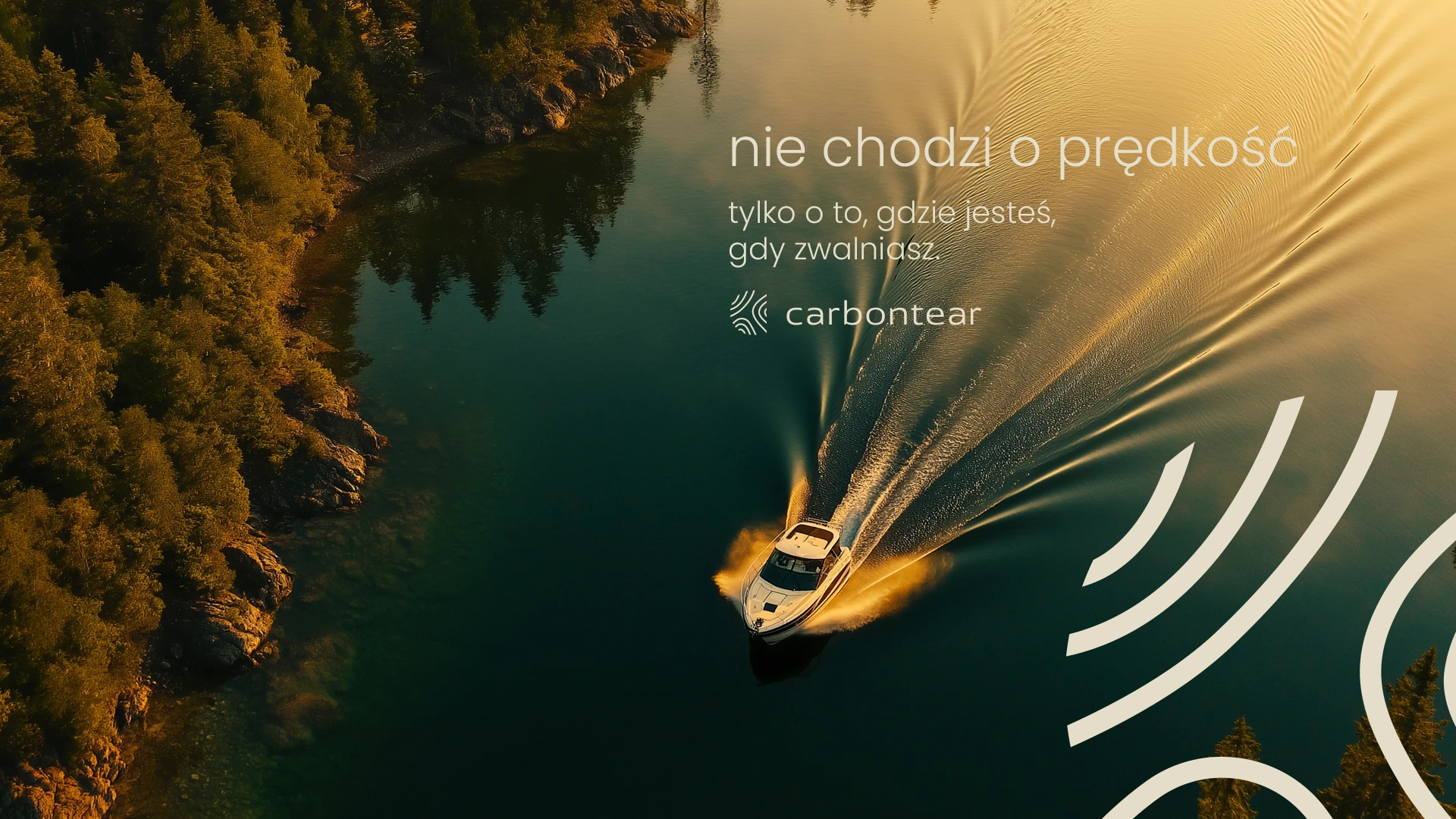
Atmospheric images and carefully selected taglines in the presentation further emphasize the emotional depth of the brand, inviting the viewer to embark on their own adventure—at their own pace.
