gryzonie.eu
Rodent and Snowflake Symbol
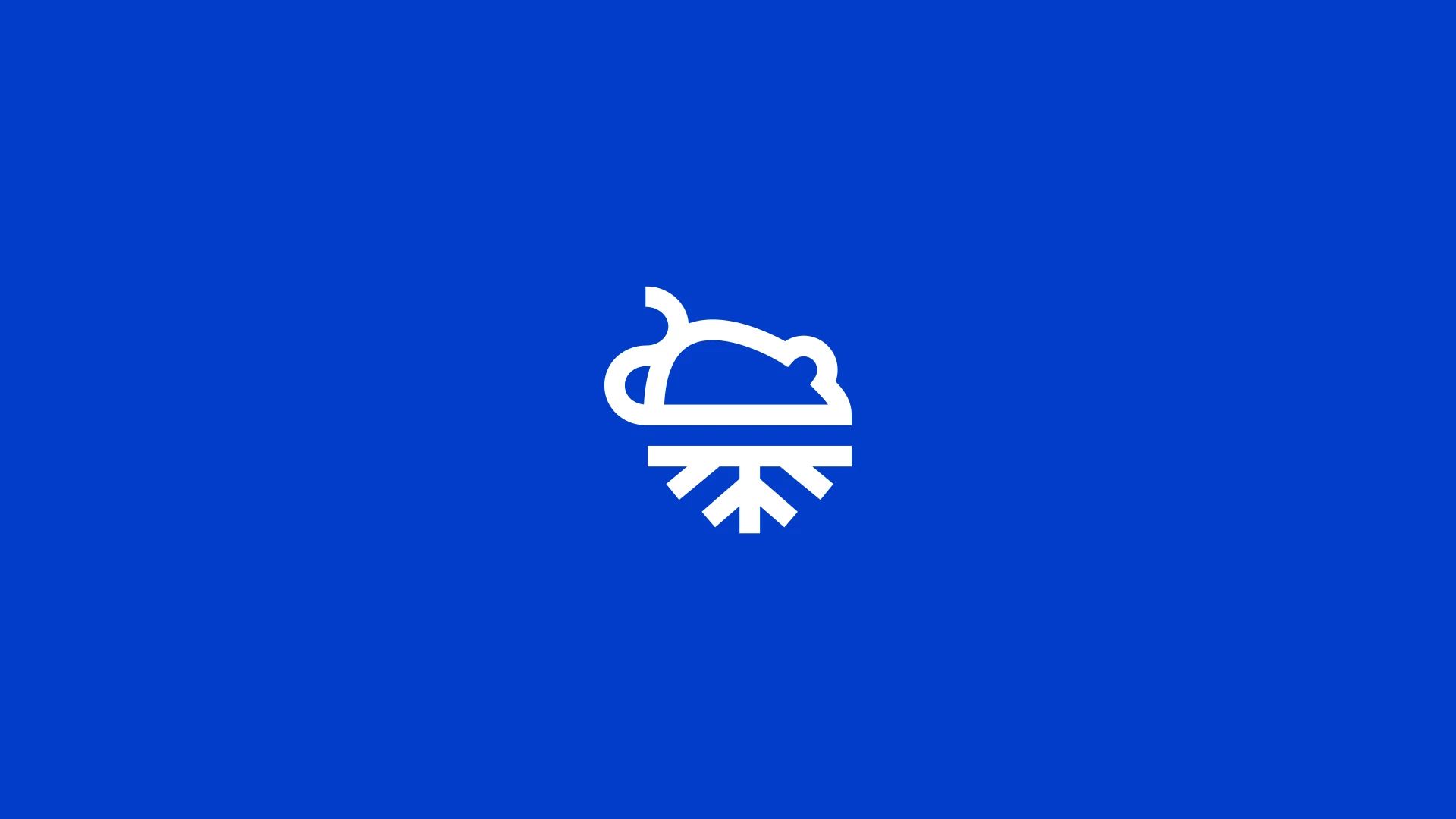
The logo features a rodent symbol, clearly referencing the company’s product offering.
Beneath the rodent is an iconic snowflake, representing freezing—a key aspect of the company’s operations, which involve selling frozen rodents.
This is a subtle yet meaningful element that highlights the nature of the products and effectively communicates how they are stored. Both symbols are simple yet functional, reinforcing the brand’s visual message.
Color Palette
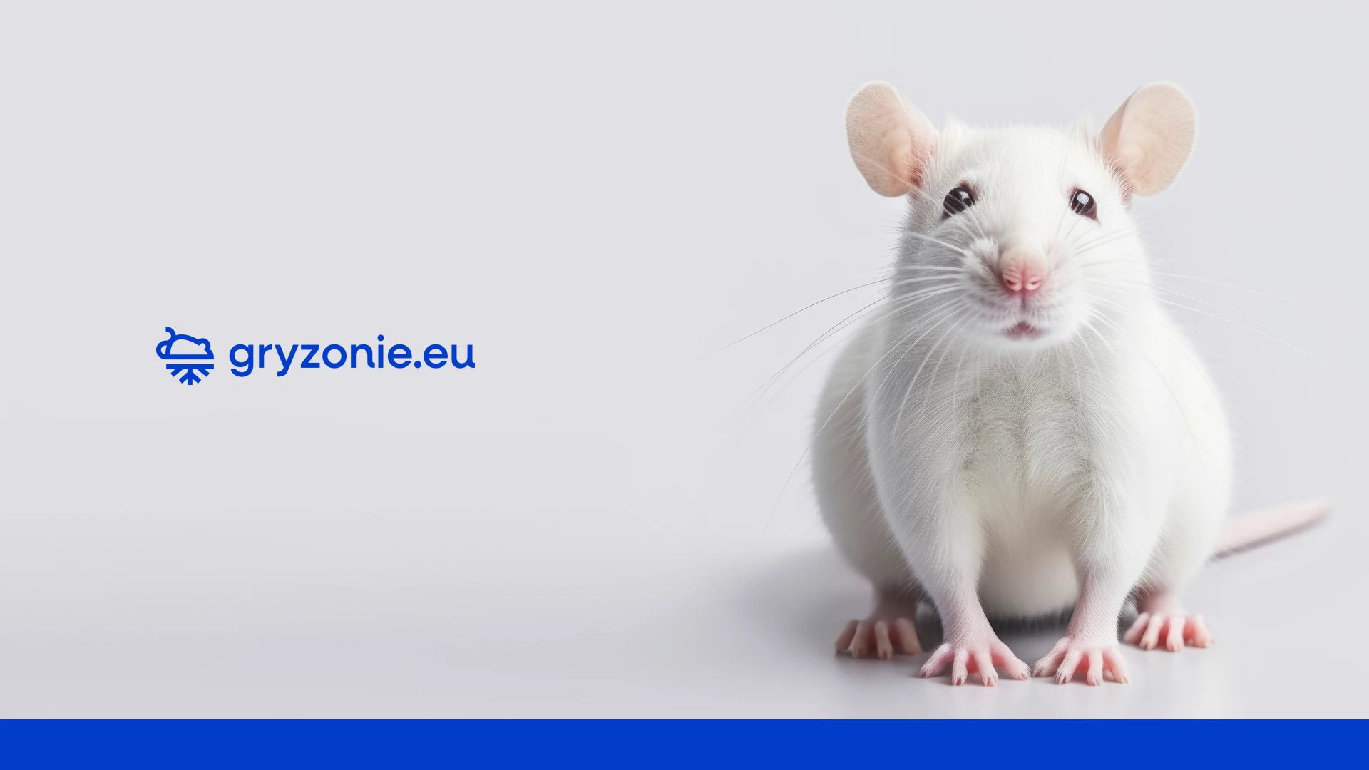
A strong blue color is used to create contrast against a white background, making the logo highly visible and attention-grabbing.
Blue conveys professionalism and trust, which can help build positive associations with customers.
Typography
The name gryzonie.eu, written in lowercase, appears more fluid and modern.
The simple, legible typeface pairs well with the minimalist symbol, resulting in a visually cohesive logo.
Graphic Applications
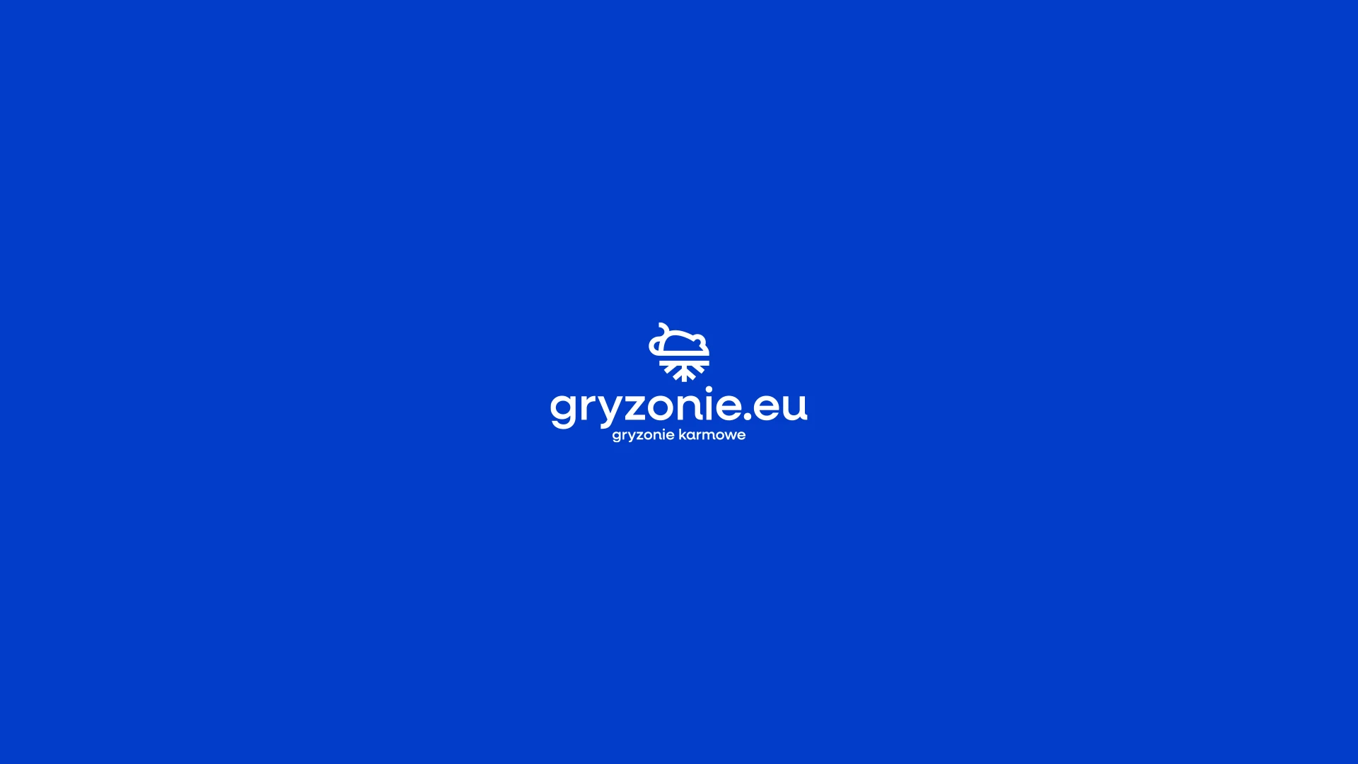
The logo is versatile—it works well both in its full form and as a standalone rodent symbol.
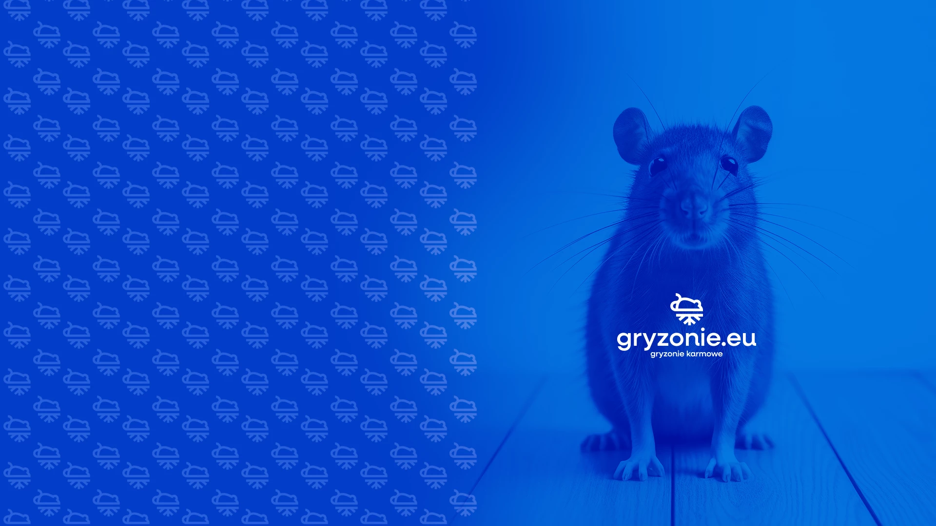
It’s easy to apply across various media, including marketing materials, business cards, and digital campaigns.
Minimalism and Legibility
The logo is highly readable, which is essential for brand recognition.
Its clean, bold lines and the rodent icon make it memorable and distinctive.
The minimalist design aligns with modern trends, helping the brand stand out in a competitive market.
