Mission Dream
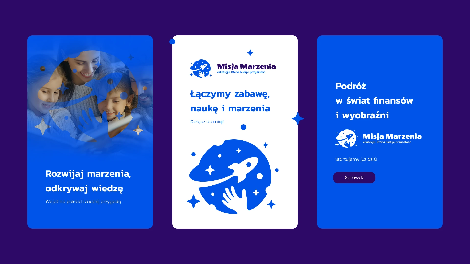
When creating the logo for Mission Dream, the starting point was the idea of education that inspires children to explore, dream, and grow. The logo was meant to be simple, modern, and clear – combining the lightness of a child’s imagination with the professionalism and trust that are essential in education.
Logo elements and their meanings:
Planet – a symbol of discovery, travel, and new horizons.
Rocket – a metaphor for dreams, aspirations, and striving toward goals.
Child’s hand – courage, engagement, and active participation in the learning process.
Stars – guiding lights that lead through the educational adventure and inspire action.
The entire design is based on the brand’s color palette – deep navy and violet convey professionalism and seriousness, while accents of yellow and turquoise add freshness, energy, and a sense of childlike joy.
The logo is friendly and versatile – it looks great both in print and digital materials, on large billboards and small gadgets alike. The symbol bridges generations: it appeals to children while also earning the trust of parents and teachers.


