Torken - naming, logo, brand identity.
Torken - naming, logo, brand identity.
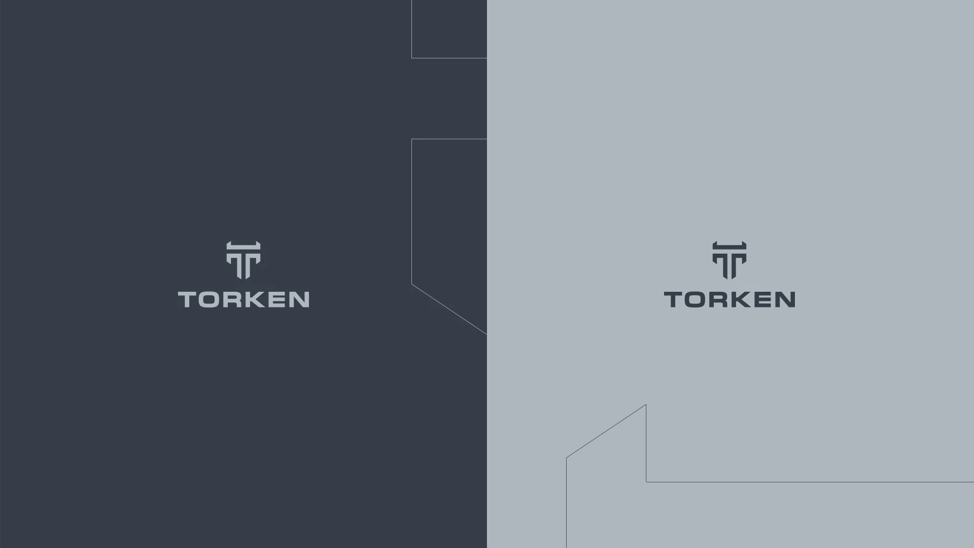
TORKEN – Naming and Logo Design
Naming
The name TORKEN was crafted to evoke a sense of strength, precision, and technological sophistication—qualities essential in the industrial sector.
Its short, punchy structure and sharp sound convey professionalism, stability, and dynamic capability, aligning with the brand's positioning in high-performance technical solutions.
Logo Concept
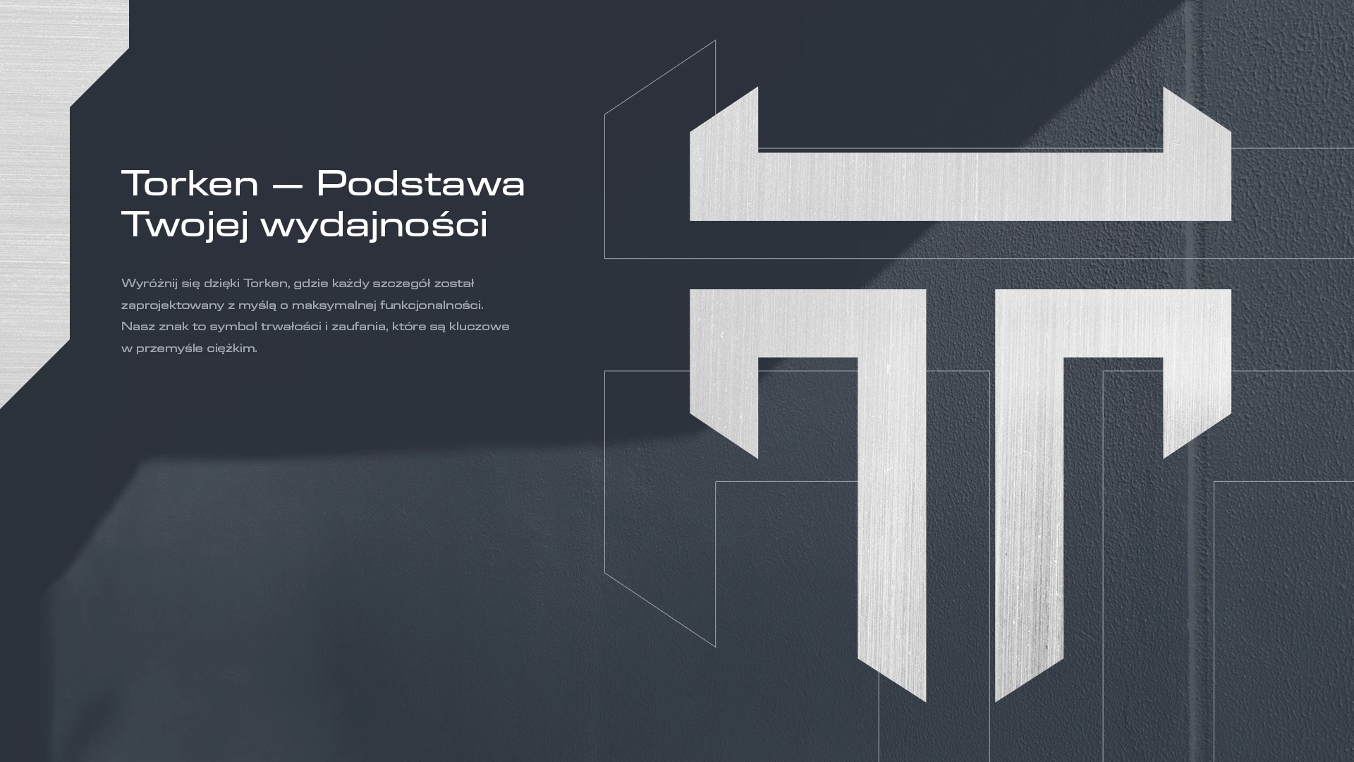
Stylized “T”
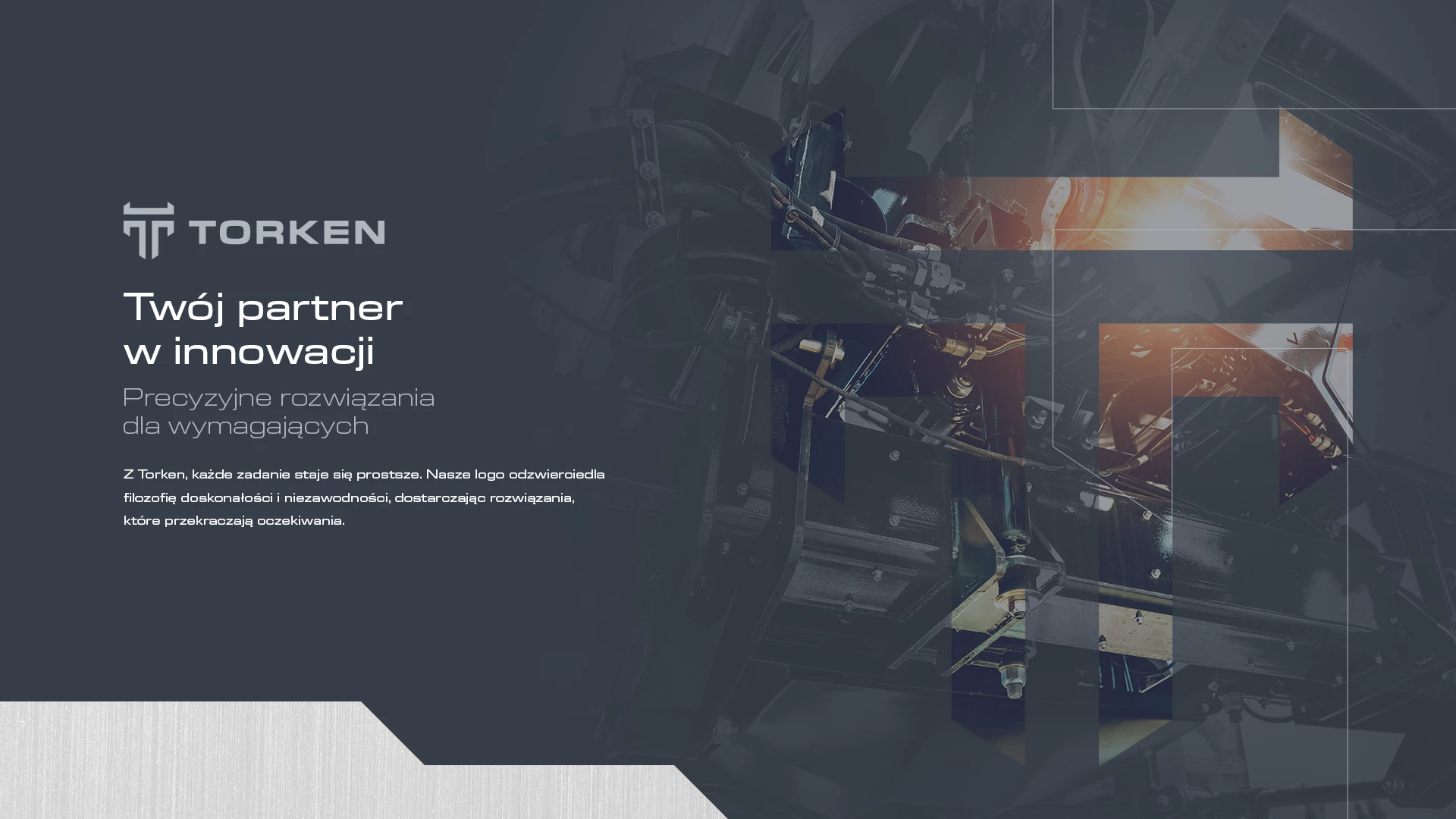
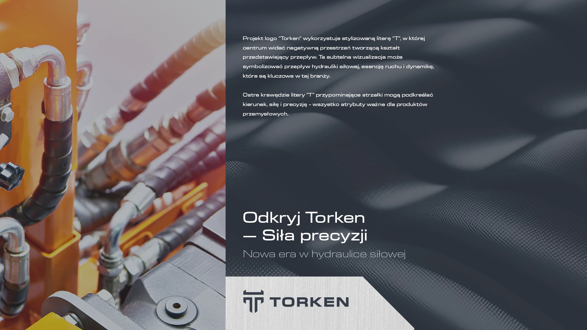
The logo centers around a bold, stylized letter T, incorporating negative space to subtly symbolize flow—a visual metaphor for hydraulic power, continuous motion, and industrial dynamics.
This flow element reflects the core functions behind many of the mechanical systems the brand represents.
Sharp Edges as Arrows
The letter’s angular shapes, resembling arrows, reinforce themes of direction, force, and precision—key traits of TORKEN’s identity and product performance.
Visual Identity Message
The design establishes TORKEN as a reliable and forward-thinking industrial brand, delivering technologically advanced solutions.
It blends technical clarity with modern design to support a brand image that is both powerful and innovative—ready to lead in demanding industrial environments.
